Reading guide
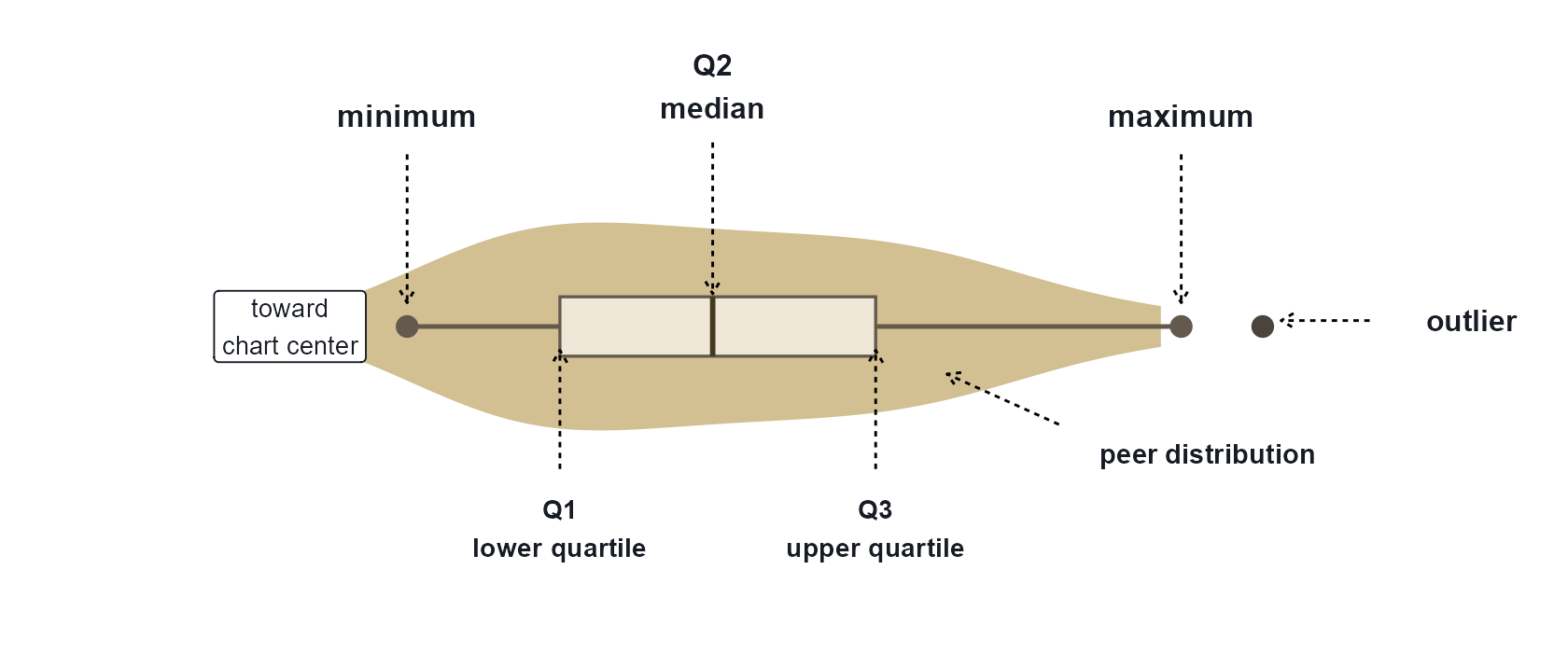
The explainer below shows one spoke in isolation. In the full chart, that same structure repeats around the circle once for each ASC factor.
- The colored violin shape shows where matching peers are concentrated for one factor.
- The box marks the interquartile range from Q1 to Q3, and the short darker line marks the median.
- The purple profile is a reference overlay: either one sampled peer, the median profile, or one of the percentile profiles.
- When Invert scale direction is enabled, higher values move closer to the center instead of farther away.